Top 7 Landing Page Mistakes That Kill Your Paid Ad Performance (And How to Fix Them)
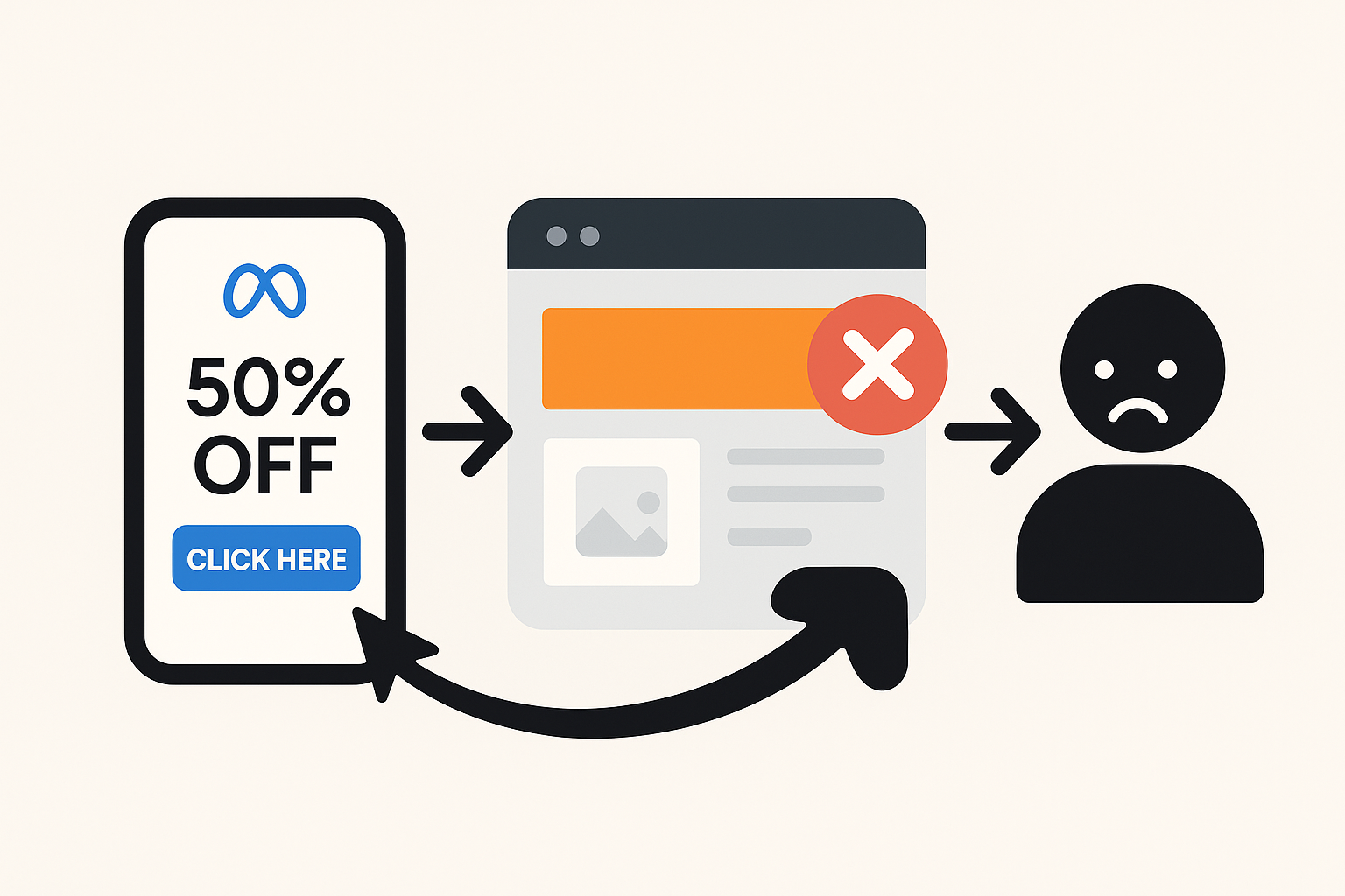
You've probably been there. Your Meta ads look incredible. The targeting is dead-on. Your click-through rate is solid. But your conversions? Silent. Your cost per acquisition keeps climbing. You keep increasing the budget hoping something changes—but it doesn't.
Here's what's really happening: your landing page is the problem. And you're probably making one (or more) of these seven critical mistakes right now.
I've audited hundreds of landing pages over the last five years, and these same errors pop up again and again. The good news? They're all fixable. Let me walk you through each one and show you exactly how to fix them before they drain another dollar from your ad budget.
Mistake #1: You're Asking Visitors to Choose Between Too Many Things
This one kills me because it's so easy to fix, yet so many brands ignore it.
Picture this: a visitor lands on your page. Your headline says "Get Your Free Trial." But then they see three buttons: "Start Free Trial," "Learn More," and "Request a Demo." Plus there's a navigation menu with links to your pricing page, blog, and about section.
Where should they click? No idea. So they don't click anything—they just leave.
The research is brutal here. Adding a second conversion goal to a landing page can drop your conversions by as much as 266%. Let that sink in. One extra choice tanks your results by more than two-thirds.¹
Your landing page should have one job and one job only. Everything else is distraction.
How to fix it:
Strip your page down to a single, crystal-clear goal. Are you collecting a lead? Make that the only conversion path. Are you selling a product? Make the buy button the hero. Remove navigation menus, hide your footer, kill the "Learn More" links. The only button that should stand out is the one that converts.
I worked with a SaaS client who had five different CTAs on their landing page—one for a free trial, one for a demo, one for pricing, one for a webinar, and one for a contact form. We deleted four of them and focused 100% on the demo request. Conversions went up 47% in two weeks. One goal. One button. Done.
Mistake #2: Your Page Takes Forever to Load
This one isn't glamorous, but it's absolutely critical.
Mobile traffic from Meta ads is somewhere around 90% of all clicks. And mobile users have no patience. If your page doesn't load in under three seconds, they're gone. Not thinking about leaving—actually gone.
The data backs this up: A one-second delay in load time reduces conversions by up to 7%. Push it to three seconds and bounce rates jump 32%. Most agencies won't even tell you this is happening because they're focused on the ads themselves. But meanwhile, you're bleeding money.²¹
Here's the frustrating part: your page might look fast when you test it on your WiFi. But visitors on 4G networks in different countries? Different story. They're waiting, frustrated, before your page even loads.
How to fix it:
Use Google PageSpeed Insights (free tool, everyone should use it). It'll tell you exactly what's slowing things down. Usually it's one of three things:
- Large images that haven't been compressed
- Too many third-party scripts running (tracking pixels, chat widgets, etc.)
- Unoptimized code or bloated templates
My go-to move: optimize and compress every image before uploading. Use a CDN (content delivery network) to serve files faster globally. Minimize the number of tracking pixels on the page—you don't need seven different pixels firing. One or two will do.
Test on your phone over a 4G network, not WiFi. That's your real test.
Mistake #3: Your Headline and Ad Copy Are Telling Completely Different Stories
A visitor sees your Meta ad: "Get 50% Off Your First Order Today."
They click. They land on your page. The headline says: "Discover Premium Quality Skincare."
Confusion. Mismatch. Bounce.
This is message misalignment, and it's one of the top conversion killers. Your landing page headline should echo your ad headline. Not necessarily word-for-word, but the promise has to be identical.³¹
If your ad talks about a specific discount, your page headline should mention that discount immediately. If your ad focuses on speed, your page should lead with speed. The visitor should feel like they're continuing a conversation, not starting a new one.
How to fix it:
Your landing page headline should use the same core promise as your ad. Even better? Use the exact same headline or a very close variation.
Here's a real example: A fitness brand's ad said "Lose 10 Pounds in 30 Days Guaranteed." Their landing page headline was "The Ultimate Fitness Program." Mismatch. We changed the landing page headline to "The 30-Day Guaranteed Weight Loss Program" and conversions jumped 34%. Same offer, matching message.¹
Also: make sure your value prop stays consistent throughout the page. If you promise speed in the headline, talk about speed in the subheadings. If you lead with affordability, keep that thread woven through the page.
If you're looking to systematize this process and ensure perfect alignment across all your campaigns, tools like AdAlign can help you track messaging consistency and identify mismatches before they tank your conversions.
Mistake #4: Your Design Is Cluttered and Confusing
Blank space isn't wasted space. It's breathing room.
Too many brands fill their landing pages with walls of text, competing visuals, bright colors everywhere, and animations that move constantly. It looks "dynamic" to the designer. To your visitor? It's overwhelming.
People scan web pages. They don't read them word for word. In fact, 74% of a visitor's attention is focused on what's visible above the fold. If they see a cluttered mess, they're bouncing before they even scroll.⁴
How to fix it:
Design for simplicity. Here's what a high-converting landing page looks like:
- One clear headline that communicates your offer (above the fold)
- Short subheading that expands on the promise
- Clean white space that lets the eye rest
- One power image or video that relates to your offer
- 3-5 short benefit statements (not paragraphs)
- One CTA button that stands out visually
- Social proof (reviews, testimonials, logos) to build trust
- Optional: FAQ section if you need to address objections
That's it. Everything else is clutter.
Also, use a consistent color scheme. Don't make your CTA button purple when the rest of the page is blue. Make it pop. Make it obvious where the user should click.
Mistake #5: Your Form Is Asking for Way Too Much Information
Here's a psychology principle that most advertisers ignore: the longer your form, the fewer conversions you get.
If you're running top-of-funnel ads (awareness stage), people are just discovering you. They're curious, not committed. Asking for ten form fields—first name, last name, company, title, phone, email, website, budget, timeline, specific pain points—feels like you're asking them to sign a contract.
They're going to bounce and give their information to your competitor who only asked for an email.
How to fix it:
Match your form length to your funnel stage.
- Top of funnel (awareness ads): Ask for name and email only. Maybe company. That's it.
- Middle of funnel (consideration): You can ask for 4-5 fields. Company, title, phone, specific use case.
- Bottom of funnel (decision): Now you can ask for more detail. Budget, timeline, decision-makers, specific requirements.
One brand I worked with had a 9-field form for leads on top-of-funnel awareness ads. We cut it down to 2 fields: email and company. Lead volume went up 67% and cost per lead dropped 42%. They had fewer "leads" in the database, but they qualified much better in the next stage. Quality over quantity.
Also pro tip: if you're using a long form, add a progress bar. Showing the user they're 33% done makes a huge difference psychologically.
Mistake #6: You're Missing Trust Signals and Social Proof
Visitors land on your page and have one immediate thought: "Should I trust this company?"
If they see no reviews, no testimonials, no case study results, no security badges, no guarantee—they assume you're not trustworthy. And they bounce.
How to fix it:
Add trust signals strategically:
- Customer testimonials with photos and company names (way more powerful than generic quotes)
- Case study results showing real numbers ("Increased conversions by 34%")
- Trust badges (SSL certificate, payment security logos, industry certifications)
- Customer logos or "Featured In" logos if you have them
- Guarantee or money-back promise to lower perceived risk
- Ratings and review counts ("4.9 stars from 2,847 customers")
Place these throughout the page, not just at the bottom. Put a testimonial or review number near your CTA. Put customer logos above the fold. Put a guarantee statement near your form. Weave trust into the narrative.
Mistake #7: You're Not Optimizing for Mobile—Or You're Doing It Wrong
Here's the brutal truth: if your landing page doesn't work perfectly on mobile, you're hemorrhaging money from Meta ads.
Over 90% of Meta traffic is mobile. Your page needs to work flawlessly on a phone screen. That means:
- Text should be readable without zooming
- Buttons should be big enough to tap (at least 44x44 pixels)
- Forms should be fillable on mobile without scrolling horizontally
- Images should scale properly and not slow the page down
- The CTA should be visible without scrolling on mobile (or appear as a sticky header)
How to fix it:
Test your page on actual devices, not just desktop. Use Google Mobile-Friendly Test (free, takes 30 seconds). But also grab an iPhone and Android phone and manually test. Click around. Try filling out the form. Does it feel natural or annoying?
Common mobile mistakes: form fields that are too narrow, CTAs that are below three scrolls, headers that collapse into hamburger menus (which people often miss), and images that take forever to load.
One client's page looked beautiful on desktop but the CTA button was only 30 pixels tall and impossible to tap on mobile. We made it bigger and more prominent. Mobile conversions jumped 28% just from that one change.
The Real Impact: What Fixing These Mistakes Actually Means
Let's talk numbers for a second.
Imagine you're spending $50,000 per month on Meta ads. Your average conversion rate across campaigns is 1.5%. That's 750 conversions per month. Your average customer value is $500, so you're generating $375,000 in revenue monthly.
Your cost per acquisition is about $67.
Now imagine you fix three of these landing page mistakes (message alignment, form length, and mobile optimization). You bump your conversion rate to 2.2%.
That same $50,000 ad spend now generates 1,100 conversions. Revenue jumps to $550,000. Your cost per acquisition drops to $45.
That's an extra $175,000 in monthly revenue from the exact same ad spend. That's $2.1 million per year.
And you didn't spend more on ads. You just optimized the page they land on.
This is why landing page optimization is the highest-ROI work in paid advertising. It's unglamorous, but it's incredibly powerful.
The Action Plan: Audit Your Pages This Week
Don't wait. Go through each of your active landing pages and ask these questions:
1. Single goal? Does the page have one clear conversion goal, or multiple CTAs competing for attention? 2. Mobile speed? Does it load in under 3 seconds on 4G? Use PageSpeed Insights to check. 3. Message match? Does the headline echo your ad promise exactly? 4. Clean design? Can a visitor understand your offer in 3-5 seconds without scrolling? 5. Form length? Are you asking for too much information given your funnel stage? 6. Trust signals? Are testimonials, guarantees, or social proof visible above the fold? 7. Mobile experience? Does everything work perfectly on phone? Buttons clickable? Forms fillable?
If you answered "no" to any of these, you've found your leak. Fix it. A/B test the fix. Measure the impact.
The winning campaigns aren't won on the ad platform. They're won on the landing page.
<div align="center">⁂</div>
Sources: ¹ KlientBoost Landing Page Mistakes
² North Country Growth: Landing Pages Hurting Google Ads